JOINA
Introducing “Create Your Own Challenges” to improve user retention


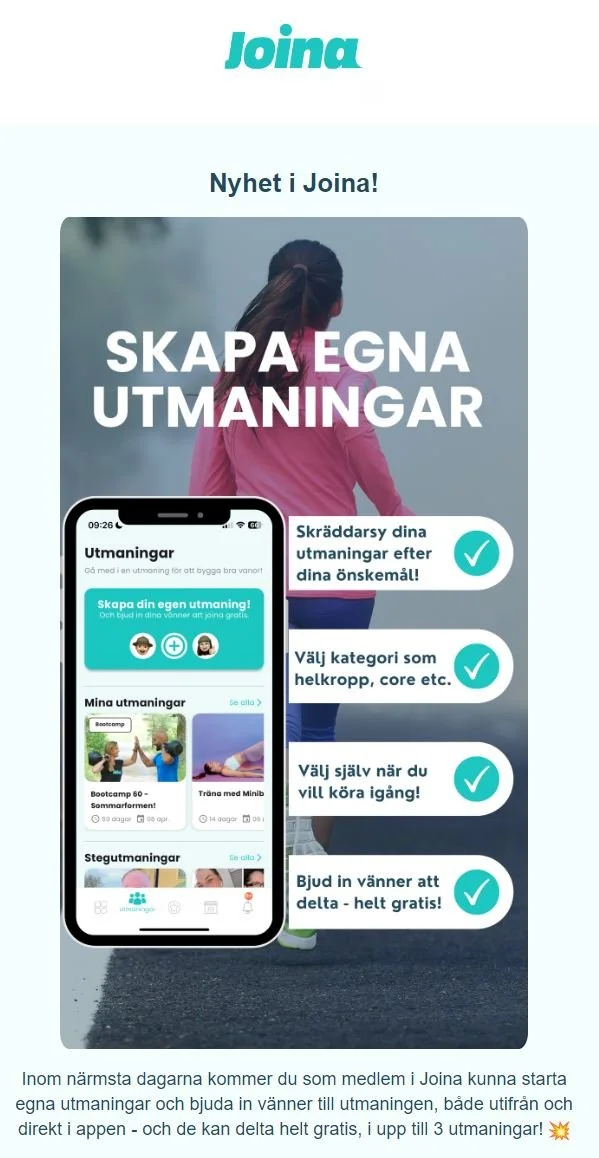
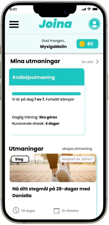
Final Product
Overview

The Client
Joina is a gamified app that transforms health and workout goals to fun and rewarding experiences. With multiple challenges to choose from, the app makes it easy for you to stay motivated and to build new habits.

The Problem
Even though they had a lot of users

They couldn’t interact with each other
And creating “Step Challenges”
Except sharing recipes…
Our Goal
Clear and simple: to explore how to increase user interactions within the community.
“We have this amazing community and we’re not taking advantage of it.”
Client Implementation
Like all good endings, Joina implemented our idea in March, 2024, and we’re super excited to see how the community reacts to it.
Our Process
Week 1
Week 2
Week 3
Week 4
Week 5
Desk Research
Surveys
Interviews
Design & Testing
How We Build Lasting Habits
To kick things off, my team and I found these 3 core influencers on how to build lasting habits:
The close (family, friends etc,.)
The many (community)
The powerful (those with status)
Conclusion:
We now had a hunch about what could be worth approaching within the app: First and foremost, people needed to interact more with their community and friends—at this point they served little to no purpose as you could barely interact with them at all.
Asking Our Users
To further solidify our direction, I created a survey for Joina
users asking if they were interested in create their own
challenges, and they gave me a resounding “yes”.
100%
I also asked what parameters they wanted control over, and the most requested options included:
Intensity Level
Challenge Duration
Friends Invitation
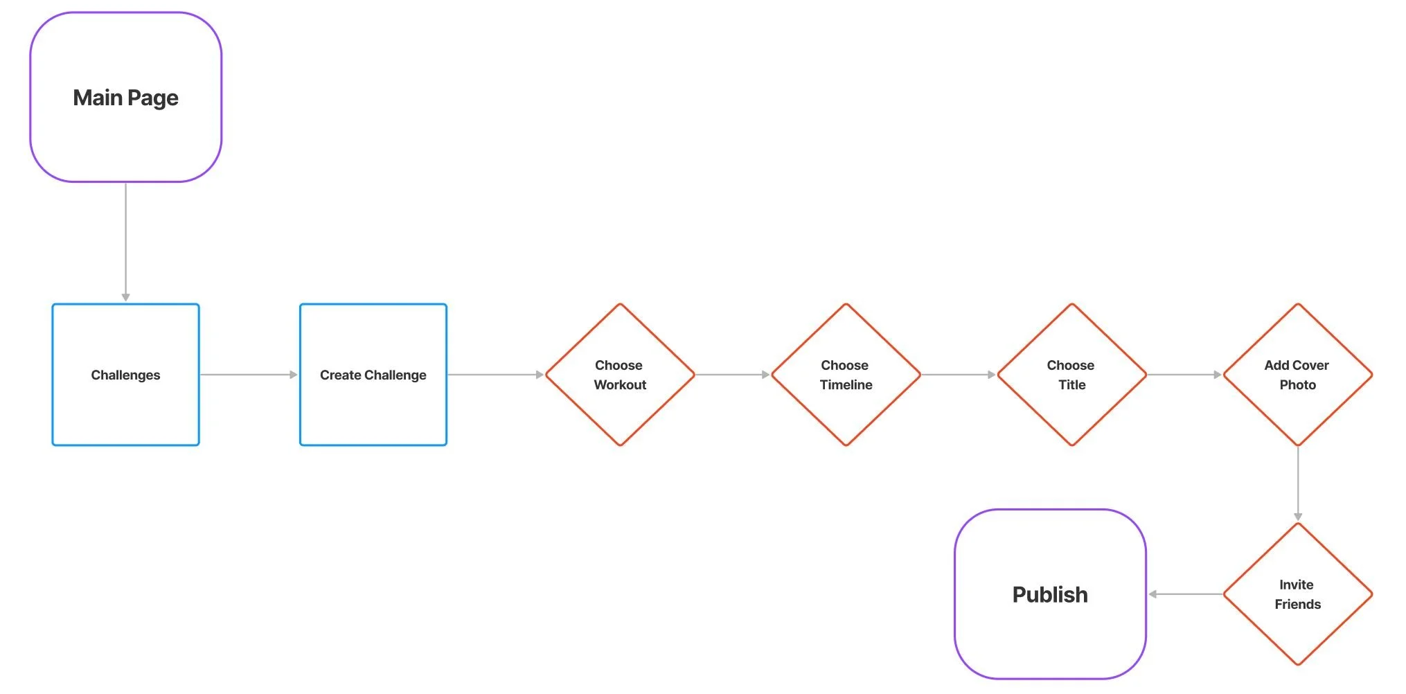
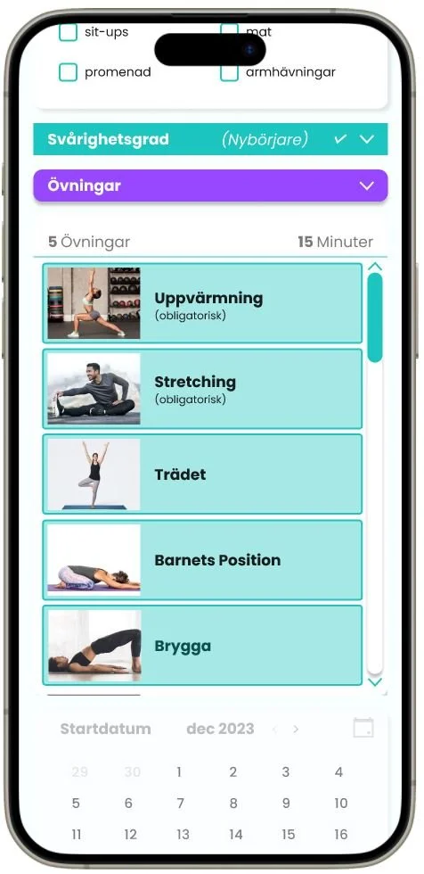
Main Happy Path
We crafted the happy path (an ideal user journey from path A to B) for “Create your own challenge” to further understand how users would navigate through the entire process.
Some things just take
experience to understand…
We had a hard time finding users to interview, because:
Unbeknownst to us, our client had given out the same email list to another group which was also working with Joina.
So users got confused when they received two near-identical emails asking for interviews.
To solve it, we:
Communicated with the other team asking them to share their contacts since they sent their emails first to not further confuse users.
Reached out to our client to get an additional users list.
This, of course, taught us a very valuable lesson:
Always double-check with the client to understand the full scope of the project and who’s working on it, but also to communicate with all parties involved and have a closer collaboration from the get-go.
Incorporating early testing
into user interviews
To make sure we used our time wisely, we used mock-ups to get unfiltered reactions from users we interviewed, and “Create Your Own Challenges” was once again a clear winner.

Usability & Visibility are key…
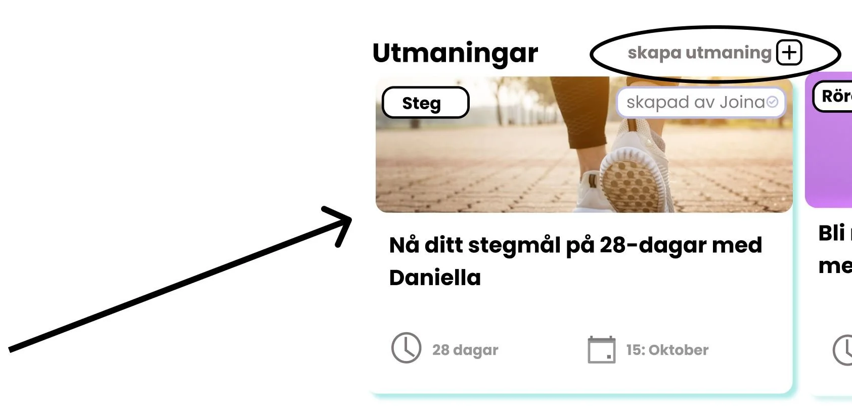
Before
Here’s an early placement of where the “Create your own challenge” CTA button was. We placed it beside “Utmaningar” (“Challenges” in Swedish) and called it “Skapa utamning” (Create challenge). Initially, that’s where it made sense for us to put it. The problem was that people couldn’t find it.
It was too small and halfway down the page.
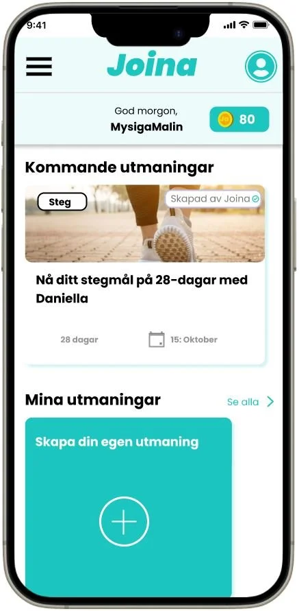
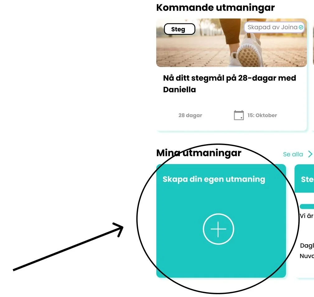
After
I made a second version and put the button directly under the “My challenges” section, and voila, users now had no issues finding the button.
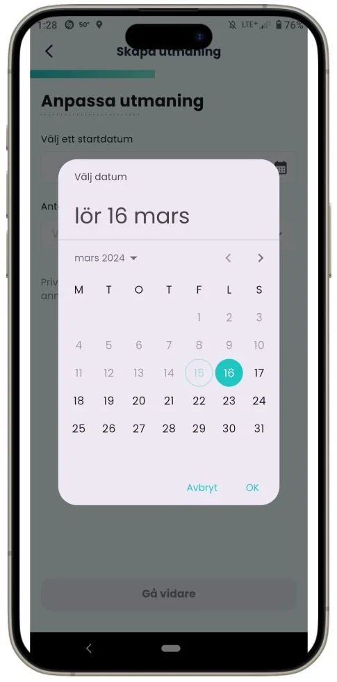
Designing in line with human nature
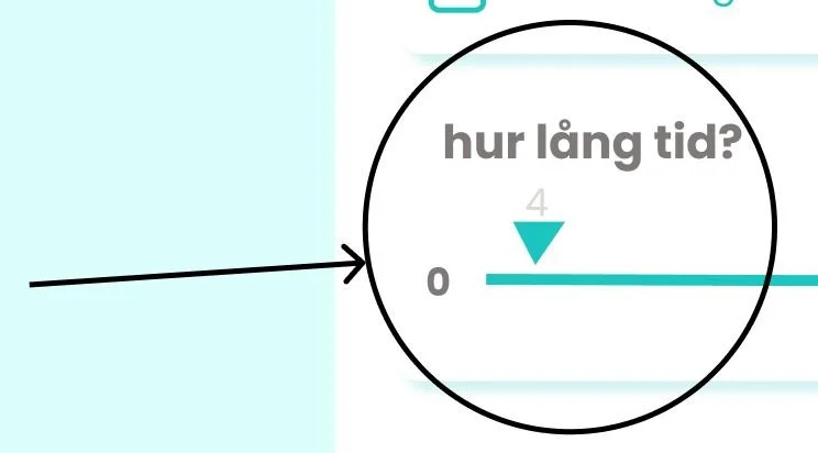
The first version my teammate did had this sliding scale to choose number of days for the challenge to last, and I questioned how easy it would be to choose the correct number of days by sliding. However, upon testing, it turned out that was just one of the issues users had interacting with it—their finger was also covering the number when they slid, which made it literally impossible to see the number.
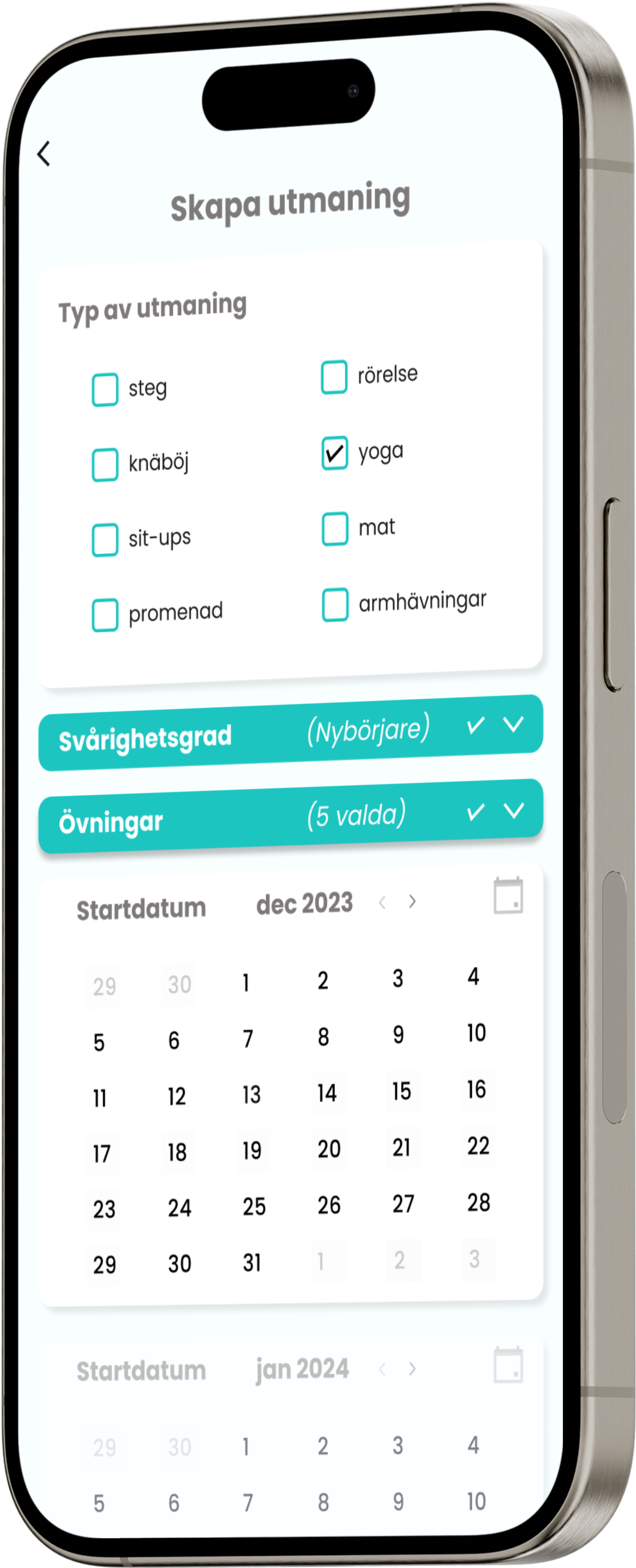
So, I suggested we change it to two calendars: one for start date and one for
end date, which another iteration of tests showed was a better option.
Before

After
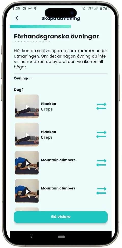
And, alas…
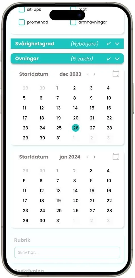
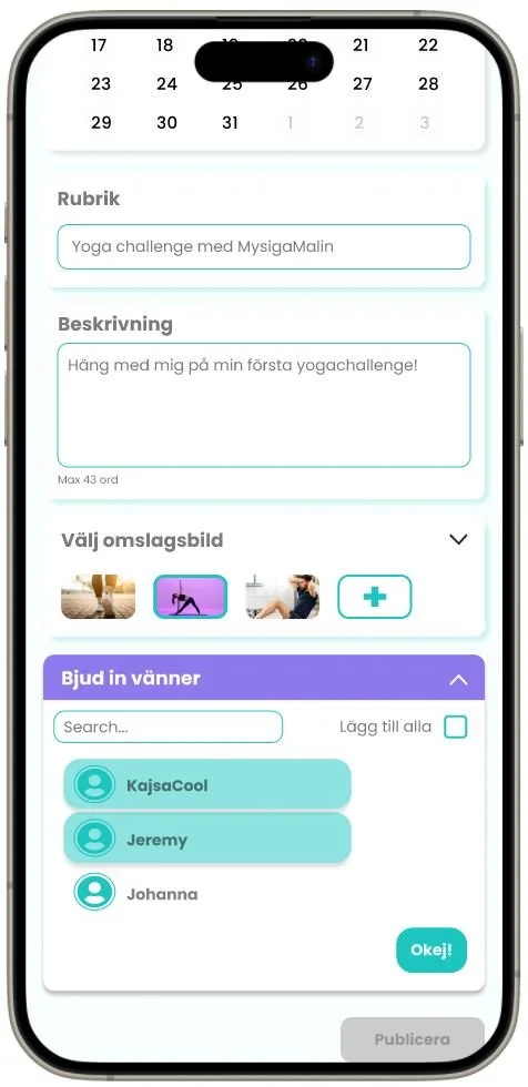
After some more nudging and testing, we ended up with our final design:
Reflection
In the beginning, we set out to solve this one problem:
How do we increase interaction between users?
And we did it!
The client’s gratitude felt evident both in her implementing our design,
but also in the words she wrote to me after our collaboration below.
But, before we get into that, I wanna leave you with some closing thoughts:
It’s really not easy being five designers in a team, and I had to act problem-solver more than once to defuse verbal situations in order to keep us on track and moving in the right direction.
Because of time pressure, we didn’t have time to properly test our final design, which I really wish we could have, if not just to give the client some suggestions.
Accessibility concerns: We were still unfamiliar with the importance of accessibility at this stage in our education, and if I would be so lucky to have the chance to go back and work on improvements, fixing contrast across the design would be one of my biggest endeavors.
Lastly, some words from our client:

“I had the pleasure to work with Alexander through our project collaboration with Hyper Island on Rapid Research & Prototyping, and I would highly recommend Alexander. His leadership was evident in his ability to keep the project on track, meet deadlines, and handle challenges. He kept everyone well-informed with clear updates. Despite the collaborative nature of the project, Alexander’s vital role was clear. I am confident in his ability to bring the same professionalism and enthusiasm to future endeavors.”